P O R T F O L I O O F D E V E N D R A S H E N D E - L E A D U S E R E X P E R I E N C E A R C H I T E C T / S P E C I A L I S T

UX Case Study
Performance Quality System
for the Medical Professionals
Led the Performance Quality App design by providing end-to-end UX solutions that helped doctors and healthcare professionals use the platform more easily and effectively.
My Contribution
User Research, Site Audits, Business Requirements, New UX Approach, Data Visualization, Information Architecture, Low/High Fidelity Wires, Visual Design, Iconography, Clickable Prototypes, Final Execution, Sign-offs, and Handover Deliverables.
Domain
Healthcare, Medical Profession
UX Engagement Timeline
8-10 Months (2023-2024)


Design Challenges
Aimed to deliver a best-in-class digital experience that simplified the existing Power BI experience and streamlined applications for products and services.
Voice of Users:
I don't have to look at multiple reports.
I want to know how I compare against my peers.
How do I improve my Quality Reports and Incentives?
The existing Power BI numbers are not accurate and it's painful to navigate through the app just to find out where I need to improve.
My Approach
Identify the primary user's needs and their goals. understand how they interact with performance data and what success looks like for them.
Simplify complex healthcare data into usable actions by using the infographics and data visualization techniques.
Prioritize scannable layouts, clear hierarchy, plain-language labels, and fast access to the important measures, gaps, and improvement opportunities.
Information Grouping into digestible sections surfaced only the most relevant content first.

Design Thinking
Every decision in this project started with a question, not an answer. I applied the five-stage Design Thinking framework — Empathize, Define, Ideate, Prototype, and Test — to ensure the redesign was grounded in real provider behavior, not assumptions.

Competitor Study
Before designing a single screen, I audited the competitive landscape to understand what providers were already experiencing in similar tools — and where the market was failing them.
What Failed
-
Language is clinical and technical
-
Navigation requires 4 to 6 clicks
-
Limited Device experience
-
No calls to action — tools show the problem but give no guidance
Tools Reviewed
MHK CareProminence, Arcadia, Azara Healthcare, Lightbeam Health, and the existing internal Power BI dashboard.
What Went Well
-
Most platforms aggregate quality data accurately and provide measure-level drill-downs.
-
Several offer basic benchmarking against regional peers.
The Design Opportunity
Be the first tool in this space that speaks the provider's language, works on a phone, and closes the loop from "here is your gap" to "here is exactly what to do."


Information Architecture
I restructured the information architecture around a single principle: financial impact first, clinical detail second. Providers scan for relevance. Show them the money at risk, then let them drill into which patients and which measures.
IA Artifacts Produced
Sitemap, screen flow diagram, navigation schema, and annotated wireframes showing content hierarchy decisions at each level.
Redesign of Navigation
I introduced a three-level hierarchy:
-
Level 1 — Performance Overview (score, unclaimed incentive, top measures)
-
Level 2 — Measure Detail (compliance rate, member list, trend over time)
-
Level 3 — Member Action (individual care gap, closure steps, outreach tools)
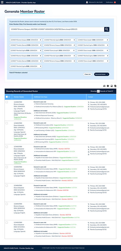
Content Grouping
-
Grouped measures by dollar impact, not alphabetically or by Tiers / Goals
-
Separated "what you've earned" from "what you could still earn" — two very different motivations
-
Surfaced the most urgent members on the Roster with meaningful dollar earnings

High Fidelity Mockups
Leveraged data visualization and infographic-based design to make quality performance data more accessible, actionable, and decision-oriented, supporting provider engagement and quality improvement. Easy, simple, and Prominent.


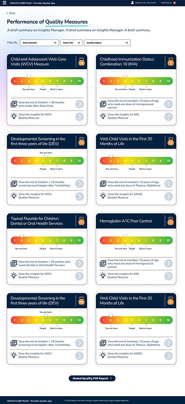
Used consistent aesthetics and purposeful iconography to make complex workflows easier to navigate and key information faster to recognize.
Applied iconography to support recognition and navigation.